Why Your Dashboards Don’t Agree (And How to Fix It)

Abitha Jeyaraj, Marketing Executive
August 18, 2026 · 7 min read
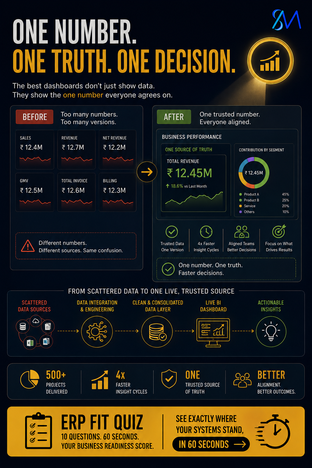
Two departments walk into the same leadership meeting with two different growth numbers. Both are technically correct. Both were pulled from systems that are functioning exactly as designed. Neither team is wrong, and that is precisely what makes the problem so difficult to fix: nobody made an error, yet the room still cannot agree on which number to act on, and the meeting quietly loses ten more minutes to a debate that a well-architected data pipeline would have made unnecessary.
This moment, multiplied across dozens of leadership meetings a year, is the real cost of disconnected dashboards, and it rarely gets diagnosed correctly because it does not look like a data quality problem. In our engineering reviews across enterprise operations, we consistently observe that most organisations have more than enough dashboards. What they lack is a single version of the truth that every team pulls from before the meeting even starts, which means the actual bottleneck is architectural, not analytical.
The cost compounds quietly. A decision that should take five minutes stretches into an hour of reconciliation, as two more people get pulled in to explain why finance’s number does not match revenue operations’. Multiply that hour by every leadership meeting held across a fiscal year, and most organisations have never actually done that math, because the cost never appears as a line item. It simply gets absorbed by whoever happens to be in the room when the discrepancy surfaces.
The gap is rarely where it first appears. Most operations leaders who take the ERP Fit Quiz find the real friction point is one layer deeper than where they have been looking.
See Where Your Operations Actually Stand — 2 Minutes
→ Speak with Our Team
Why Dashboards Multiply Faster Than Data Trust Does
It is worth being direct about why this persists even in organisations with a dedicated data or analytics function. The technical capability to unify data across systems is rarely the constraint, most modern data warehousing and BI tooling makes the connection technically straightforward. The constraint is that unifying the data requires cross-departmental agreement on definitions that each department has, reasonably, been setting independently for years. That agreement is a governance and negotiation exercise as much as a technical one, and it rarely happens organically without a dedicated effort to trace every dashboard back to its source and resolve the discrepancies deliberately.
Most enterprise organisations did not set out to build competing versions of the truth. Each department adopted a dashboard tool that solved its own immediate reporting need, at a moment when that made complete sense: finance needed a close-cycle view, revenue operations needed a pipeline view, and each was built against the specific system that team relied on daily. The problem emerged later, once those two dashboards were both presented in the same leadership meeting, each accurate within its own context, but built on different starting dates, different rounding conventions, or different definitions of what counts toward the same metric.
This is rarely discovered through a formal audit. It surfaces the way a half-second pause surfaces in a meeting, when someone reads a number aloud and nobody quite nods fast enough. Nobody says the dashboard might be wrong, because saying that out loud requires someone to take ownership of a discrepancy that, technically, no single person caused. So the discrepancy gets quietly reconciled after the meeting instead, by whoever noticed first, and the underlying architecture problem never gets addressed because it never gets named.
The organisations that eventually recognise this pattern are usually the ones where a decision sat “pending confirmation” for far longer than it should have. That phrase, in our experience across enterprise engagements, is frequently a polite way of describing a room that could not agree on which number was correct, and was not comfortable saying so directly.
This dynamic is often made worse by well-intentioned tooling decisions. A department that feels underserved by a shared central reporting function will frequently build its own dashboard using a tool it can control directly, precisely because that autonomy feels like progress. In the short term, it is progress, because that department finally gets a report tailored to how it actually works. In the medium term, it becomes another independent source of truth that nobody outside that department fully understands, and the organisation ends up with more reporting capability and less actual clarity than it had before.
How SuperBotics Builds a Single Trusted Source Across Systems
Our data and BI engineering teams rebuild this exact pipeline by tracing each department’s number back to its source system, identifying precisely where definitions, rounding conventions, or reporting periods diverge, and connecting those systems into one live, trusted data source rather than reconciling the discrepancy after the fact each time it appears. This is fundamentally an architecture project, not a dashboard redesign project, which is why it requires understanding how data actually flows between finance, operations, and revenue systems before any visualisation work begins.
We have rebuilt this exact pipeline across 500+ projects, turning scattered department-level dashboards into one connected data model that every downstream report pulls from consistently. This does not mean every team loses their preferred dashboard tool or visual format. It means every dashboard, regardless of who built it, is now drawing from the same underlying trusted data, which eliminates the discrepancy before it ever reaches a leadership meeting.
A dashboard nobody has to double-check is worth more than ten dashboards nobody fully trusts.
Our approach also includes defining clear data ownership per source, so that when a definition does need to change, there is a single accountable owner making that decision deliberately, rather than two departments independently interpreting the same metric in slightly different ways over time.
This work also typically surfaces definitional disagreements that had been quietly coexisting for years without anyone noticing, such as two departments both reporting “active customers” but counting a lapsed subscription differently in each system. Resolving these definitions is not a technical exercise alone. It usually requires a facilitated conversation between the department owners to agree on a single definition going forward, with the technical architecture then built to enforce that agreement consistently rather than leaving it open to reinterpretation the next time someone builds a new report.
The Proof: What a Unified Data Architecture Changes
Across our BI and data engineering engagements, this shift consistently changes the texture of leadership meetings. Decisions that previously required a follow-up reconciliation session now move forward in the room, because everyone present is looking at the same underlying number, sourced from the same connected pipeline. Our clients moving through this rebuild have seen insight cycles move up to 4x faster, a direct result of removing the reconciliation step that used to sit between a question being asked and a decision being made.
| Fragmented Dashboard Architecture | Unified Trusted Data Architecture |
|---|---|
| Each department reports from its own source system | All dashboards draw from one connected data model |
| Discrepancies reconciled manually after meetings | Discrepancies resolved once at the architecture level |
| Decisions delayed pending confirmation | Decisions made in the room, on trusted numbers |
The fastest way for any leadership team to see exactly where their own reporting gap sits is a direct, structured assessment rather than another internal audit that competes for the same team’s already limited bandwidth.
There is also a cultural shift that follows the architectural one. Once a leadership team has experienced even a single quarter of meetings where nobody needs to quietly reconcile a number afterward, the appetite for tolerating fragmented reporting elsewhere in the organisation tends to disappear quickly. The unified data architecture becomes the new baseline expectation, rather than an occasional improvement project that gets revisited only after the next high-profile discrepancy forces the conversation again.
What SuperBotics Specifically Offers
For organisations experiencing this exact dashboard trust gap, our data and BI engineering practice traces each department’s reporting back to source, rebuilds the underlying data pipeline into a single connected architecture, and assigns clear ownership so future definition changes happen deliberately rather than by accident. This work spans finance, operations, and revenue reporting environments, scoped around the specific systems already generating your organisation’s data today.
The fastest way to see where your own gap sits is the ERP Fit Quiz — 60 seconds, 10 questions.
It hands back your personalized Business Readiness score and the root causes behind today’s reporting gaps.
See Exactly Where Your Systems Stand — 60 Seconds
→ Speak with Our Team
The organisations making the fastest decisions this year share one architectural trait: a single data source that everyone in the room trusts before the meeting starts, not a collection of individually accurate dashboards that happen to disagree with each other.
Every leadership team we have worked with initially assumed their reporting discrepancy was a one-off data entry issue somewhere in the chain. It almost never is. It is architecture, and once it is rebuilt correctly, the half-second pause after someone reads a number aloud finally disappears.